


The Golden Rule of Remodeling. Spend to your house, not your dreams. Total renovation spending stays under roughly 30 percent of your home’s current market value, and any single kitchen stays in the 5 to 15 percent band, because money spent past what your neighborhood supports does not come back at resale.
The 3-Colour Palette. One dominant color at about sixty percent of a space, one secondary at thirty, one accent at ten, chosen once for the whole house and reshuffled room by room.
The 2-Metal Limit. One dominant metal carrying most of the finishes, one accent, a third only if you know exactly why, with warm and cool undertones kept deliberate rather than accidental.
The Fixed-Elements Rule. The surfaces that are not changing, countertops, tile, stone, flooring, get identified first, their undertones named, and every later color and metal choice built to relate to them.
Phasing Without Drift. A one page palette document made before phase one and checked before every purchase, because a plan that lives in memory loses to the store aisle every time.
Walk the hallway of a house that got remodeled one room at a time and you can read the years right off the walls. The kitchen is 2019, warm gray with brushed brass, back when everyone wanted that. The hall bath is 2021, cool white and matte black. The primary bath is 2023 and suddenly everything is bronze and cream. Every single room is nice. The house does not match itself, and the owner cannot tell you why, because each decision was reasonable on the day somebody made it.
That failure has a name in remodeling, drift, and it is not a taste problem. It is a systems problem, and the fix is a small set of numbers you decide once and obey for years. Three colors. Two metals, maybe a third. One rule about the finishes you cannot change. Hold those and a six year phased remodel comes out looking like it was designed in one afternoon, so let me take the numbers in order.
One budget note before the design rules, because it frames everything after it. The remodeling trade’s oldest money guideline, the 30 percent rule, caps total renovation spending at about 30 percent of the home’s current market value, and the National Kitchen and Bath Association’s version narrows it further, 5 to 15 percent of home value for a kitchen and 3 to 7 for a bathroom. The reasoning is blunt. A $150,000 kitchen in a $400,000 neighborhood is a loss on installation day, since buyers compare houses against the street, not against your receipts. Every palette and metal decision below happens inside that ceiling, which is honestly useful discipline, because a constrained budget forces the exact repetition of finishes that cohesion needs anyway.
The 60-30-10 Rule Is The Three Color Budget, And It Scales From A Room To A Whole House
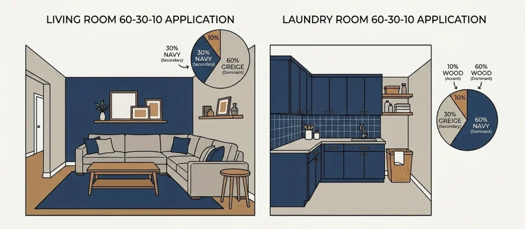
Designers have leaned on this ratio for so long that one Dubai design principal calls it an old wives’ tale of the trade, and the mechanics are plain enough. A dominant color takes about sixty percent of a space, walls and the big surfaces, the backdrop. A secondary takes thirty, cabinetry, an accent wall, the major textiles. An accent takes the last ten, the pop that keeps a room from going flat. As designer Amanda Wyatt puts it in House Beautiful’s breakdown of the rule, there are no hard rules in interior design, but the formula gives people a confident place to start.
For remodeling rather than decorating, the useful part is that the ratio scales. Pick the three for the house, not the room, and then let each room shuffle the same three into different percentages. The dominant greige of the living room becomes the thirty percent cabinet color in the laundry. The navy that was a ten percent accent in the hallway becomes the sixty percent statement of the powder room. Same palette, different weights, and every room reads like a verse of one song. The drifted hallway house never had a palette to shuffle, which is most of its story.
Can The Three Include Two Neutrals And Only One Real Color?
Yes, and for most homes it should, because neutrals carry undertones that do the harmonizing work quietly, which is exactly where the next rule comes in.
Two Metals Is The Finish Budget, And The Ratio Has Numbers Too
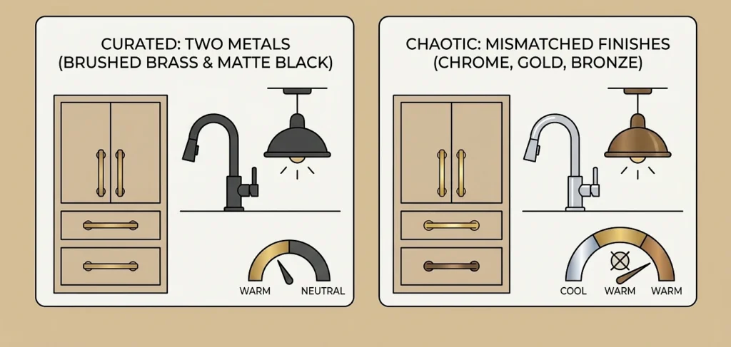
A faucet here, a light fixture there, cabinet pulls on sale. Metal finishes drift faster than paint because they arrive one purchase at a time, and the designer guidance on containing them is unusually consistent. Pick one dominant metal and let it carry roughly sixty to seventy five percent of the finishes in a space, then one or two accents for the rest, and mind the undertones, since brass, copper, gold, and nickel run warm while chrome and stainless run cool, with matte black sitting neutral. New standout kitchen and bath designer Melissa Sakell gives the ceiling plainly, two or three metal tones keeps the look intentional, and any more than that shifts the effect from curated to chaotic.
Two practical moves carry most of the weight. Give each hardware category one finish, pulls in the dominant, the faucet in the accent, so the mix reads as decided rather than accumulated. And when two metals sit far apart, polished stainless against aged copper, bridge them with something in the middle like brushed nickel. The near miss is the actual danger here rather than the contrast, since two finishes that almost match look like a matching attempt that missed, while two that clearly differ look chosen. Speaking of brushed brass, it is worth remembering that the 2019 wave of it in our hallway house was itself a reaction to a decade of builder chrome, and the current bronze moment is a reaction to the brass. Metal trends run in roughly ten year swings, which is one more argument for picking finishes you personally like over whatever the aisle likes this season.
The Fixed Elements Rule Decides Everything Else, Which Is Why It Comes First In Real Projects
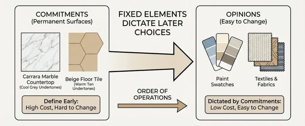
Color consultant Maria Killam built a whole methodology around what she calls fixed elements, the countertops, tile, stone, brick, and flooring that are not changing, and her core observation is that every one of them carries an undertone, even Carrara marble, and the more earthy fixed finishes a home has, the less freedom every later choice gets. You cannot ignore those surfaces. Paint is an opinion. Tile is a commitment.
So the working rule for a phased remodel is short. Identify the fixed elements that will survive every phase, name their undertones, and build the three color and two metal budgets to relate to them, because the fixed elements will outvote anything that ignores them. The 2019 warm gray kitchen and the 2021 cool white bath in our hallway house were both fine rooms. They were also both arguing with the same beige floor tile running through the whole story, and the tile was there first and staying longest.
This settles the order of operations question people get backwards, too. Choose the long lived surfaces first and the repaintable ones last, since a countertop picked to match a trendy wall color ties a ten year surface to a two year opinion, and only one of those two is easy to fix later.
Phasing Without Drift Is A Document, Not A Memory
The reason phased remodels drift is not that owners change. Trends change, stores change, and the person standing in the fixture aisle in year four is choosing against whatever surrounds them that day, not against a kitchen finished three years back. Memory loses that fight to the aisle nearly every time, which is why the anti drift tool is paper.
One page, made before phase one, checked before every purchase after, and here is what goes on it. The three colors with exact manufacturer names and codes, not descriptions, because “warm white” names forty different paints, and by the way, paint names are marketing, not information, the same beige sells under a dozen poetic names across brands and the code is the only part that means anything. The dominant and accent metals with their finish names written out, brushed brass and matte black, not “gold and dark”. The fixed elements and their undertones, meaning the surfaces every future choice has to relate to. And physical samples, an actual drawer with the tile offcut and a painted swatch card and a cabinet pull in it, because screens lie about undertones and store lighting lies worse.
Then the discipline, which is one sentence long. Nothing enters the house that is not on the page, and the page only changes on purpose, all phases reconsidered at once, never one aisle decision at a time. Drift never announces itself as a redesign. It arrives as a single reasonable purchase that is slightly off the page, then a second one that matches the first instead of the plan, and by year three the plan is a minority opinion in its own house. Frankly, and this is my whole advice on phasing compressed to one line, the document does not need to be pretty. It needs to be present, in the phone, at the store, at the moment of weakness.
The drifted hallway house from the opening could have been saved by twenty minutes of that paperwork in 2019. Three colors, two metals, the undertones of one beige floor written down and respected. The rooms would have cost the same.

