

You had the subject. You had the light. You had a perfectly good camera in your hands. And then you got home, pulled the photo up on the screen, and it just sat there, flat, not doing any of the thing it did when you were standing there. I’ve been there more times than I’d like to admit, and here’s what I eventually worked out. It almost always comes down to composition, which is just the arrangement of everything inside the frame, and it’s the part that separates a photo that records a scene from one that actually pulls somebody in.
Before I go through these, one thing I want to say up front, because it colors everything below. These aren’t laws. I think of them as principles, not rules. A rule tells you do this or don’t do that. A principle tells you that when you do a certain thing, a certain effect happens, and then the choice is yours. Learn them so your eye starts seeing them without effort, and then feel free to ignore any of them when your gut says the shot wants something else. If you want the technical companion to this, the beginners guide to UV, ND and polariser lens filters covers the gear side, but composition is the part that lives in your eye, not your bag.
1. The Rule Of Thirds Is Where Everybody Starts, And For Good Reason
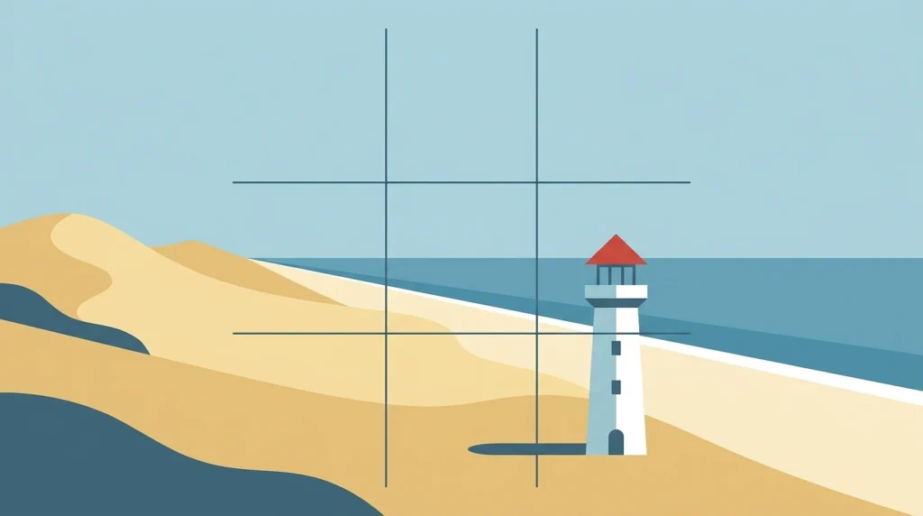
This was the first thing I ever learned, and it’s still the one I reach for when a frame isn’t working and I can’t say why.
The idea is simple. Imagine your frame split into nine equal boxes by two lines going across and two going down, like a tic-tac-toe grid laid over the scene. You put the important stuff on those lines, or better yet on the four points where they cross. That’s it. Your camera almost certainly has a setting to show this grid on the screen, so turn it on, it’s the fastest way to train your eye. Older film bodies won’t have it, in which case you just imagine it, and after a while you won’t need either, you’ll see the grid whether you want to or not.
It isn’t arbitrary either. The idea traces back to a painter named John Thomas Smith who wrote about it in 1797, so this is centuries older than photography, and part of why it works is that the eye doesn’t actually go to the dead center of a picture first. It scans. Put your subject off to one of those intersections and you give the eye somewhere to travel, which reads as more dynamic than something planted in the middle.
For landscapes, this mostly comes down to the horizon. Don’t cut the frame in half. Run the horizon along the top third or the bottom third depending on what’s worth showing. Gorgeous sky and boring foreground? Horizon low, give the sky two thirds. Mountains reflected in a lake, with a dull sky above? Flip it, horizon high. And keep this in mind at the editing stage too, because the crop tool is where you fix the shots you didn’t quite nail in the moment.
2. Leading Lines Pull The Eye Exactly Where You Want It
Here’s a technique that does real work once you start seeing it everywhere. A line in the scene, and I mean any line, guides your viewer’s eye along it, and if that line runs toward your subject, you’ve basically taken the viewer by the hand and walked them to the point of the photo.
The catch, and it’s the mistake I see most, is direction. A line that runs off to the side of the frame leads the eye straight out of the picture, which is the last thing you want. You’re looking for lines that pull inward. They usually start down near the bottom of the frame and draw upward and inward toward the subject or the background.
Roads, paths, train tracks, fences, rivers, a run of trees, the edge of a building, even a repeating pattern can do it. And if you want to really exaggerate the pull, the way a road seems to rush toward a vanishing point, a wide-angle lens stretches that sense of depth and makes the effect dramatic.
3. Frame Your Subject With The Scene Itself
Think of an archway, a window, a doorway, a gap in some overhanging branches. When you shoot your subject through one of those, you’ve built a frame inside your frame.
What that does is add layers, and layers add depth, and depth is a lot of what makes a flat rectangle feel like a window into a real place. It also does something sneaky and useful, it walls off distractions around the edges and funnels the eye straight to the focal point. Once you start hunting for these natural frames you’ll spot them constantly, and it’s one of the quicker ways to make an ordinary shot feel considered.
4. Fill The Frame And Commit To Your Subject
Sometimes the strongest move is to just get closer. Let the subject take up the whole frame, edge to edge, so it’s unmistakably the point of the photograph.
This kills off background clutter almost automatically, because there’s barely any background left. But the part I like about it is subtler, filling the frame forces you to actually think about your subject, what’s interesting about it, which part deserves the space. You stop shooting the scene the subject happens to be in and start shooting the subject.
5. Keep It Simple, Because Less Really Does Hit Harder
When a photo feels off and busy, the problem is usually that you tried to cram too much in. I do this constantly and have to catch myself.
A clean, minimal image is not a boring one. Often it’s the opposite. Because there’s so little in the frame, whatever is there carries enormous weight, and the viewer has nowhere else to look. This is really the Gestalt idea that the eye craves order, it groups and simplifies whatever it sees, so when you hand it something already simple, it settles immediately and feels the subject rather than working to find it. One strong element against a quiet background can land far harder than a frame stuffed with competing things.
6. Move. Change Your Viewpoint Before You Shoot.
You spot something good, and the reflex is to stand right where you are, raise the camera, and fire. Don’t. That eye-level shot from wherever you happened to be standing is the same shot everyone else takes.
The single easiest way to make a more interesting photo is to change where you’re shooting from, because it changes the whole feel. Get down low and your subject looms up and reads as powerful and dominant. Shoot from up high looking down and the subject can feel small, vulnerable. So lie flat on the ground. Climb up on something. Crouch, lean, whatever gets you an angle most people wouldn’t bother to find. Half the time the difference between an ordinary photo and one that makes somebody stop is just that you moved your feet.
7. Give Your Subject Room With Negative Space
Negative space is the empty area around your subject, and used on purpose it’s one of the most powerful tools you’ve got. Isolate a single thing, a bird, an insect, a lone tree, and let emptiness surround it. That emptiness strips away distraction and forces a real connection with the subject.
One way to create it even in a busy scene is a shallow depth of field, shooting wide open so the background melts into soft blur, that creamy bokeh, and separates cleanly from your subject.
But here’s the part people miss. The empty space itself can be as much the point as the subject, as long as the balance feels right. And one practical rule of thumb worth holding onto, for a person, an animal, or anything moving, leave the extra space in the direction they’re looking or heading. Somebody gazing to the right wants room on the right to gaze into. Crowd them against that edge and the shot feels trapped and wrong, even to a viewer who couldn’t tell you why.
8. Balance The Weight Across The Frame
Every element in a photo has a kind of visual weight, and composition is partly the job of arranging those weights so no one corner of the image bullies the rest.
There are two flavors of this. Formal balance is symmetrical, your subject dead center, both sides mirroring, which is the classic portrait setup and feels calm and stable. Informal balance is the trickier, more interesting one, you take a big important element and offset it against one or more smaller, different elements elsewhere in the frame, and they hold each other in tension. The rule of thirds is really just informal balance in action. And it isn’t only about objects, you can balance a patch of color against another, light against dark, a smooth area against a textured one.
9. Sometimes Dead Center Is Exactly Right

Isn’t this the opposite of the rule of thirds? Yes. Completely. Which is my whole point about these being principles and not laws.
Planting your subject smack in the middle works, and works beautifully, when the scene is symmetrical, a reflection, a hallway, a face straight on. The symmetry needs a centered composition to pay off. It’s also the smart move when you’re shooting a person on a wide-angle lens, because wide lenses distort toward the edges, and keeping the subject centered keeps them from stretching. I lean on center framing for square crops too, the kind of thing headed for Instagram, where a centered subject just sits better in the format.
10. Use Foreground To Build Depth
A photograph is flat, and a lot of composition is quietly fighting that flatness. One of the best weapons is foreground, something placed between you and your main subject, down low in the frame.
It can be almost anything, rocks, grass, a fence, a stretch of water, whatever sits in that near zone. It fills space that might otherwise read as dead and empty, and more importantly it gives the eye a near thing, a middle thing, and a far thing, which the brain reads as depth. This pairs especially well with a wide-angle lens, which stretches the sense of distance and makes those foreground elements loom large and close, exaggerating the whole three-dimensional feel. If you want to go further on this, the long exposure photography tips for beginners piece gets into using foreground with slow shutter work on water and skies.